What the 2026 Paint Colors of the Year Tell Us About Where We Are Now


You can tell a lot about a culture by the colors it chooses to live with.
Not the colors of runway shows or viral trends, but the ones people actually paint on their walls. Those colors whisper what we’re craving, what we’re tired of, and what we’re quietly hoping for in the years ahead.
And looking at the 2026 Paint Colors of the Year, the message is clear.
We’re slowing down. We’re softening. We’re reaching for comfort, connection and depth. We want our homes to feel like home again.
The Colors: Deep, Warm, Grounded
Across the major paint brands, 2026 has delivered a surprisingly unified palette.
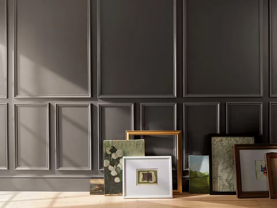
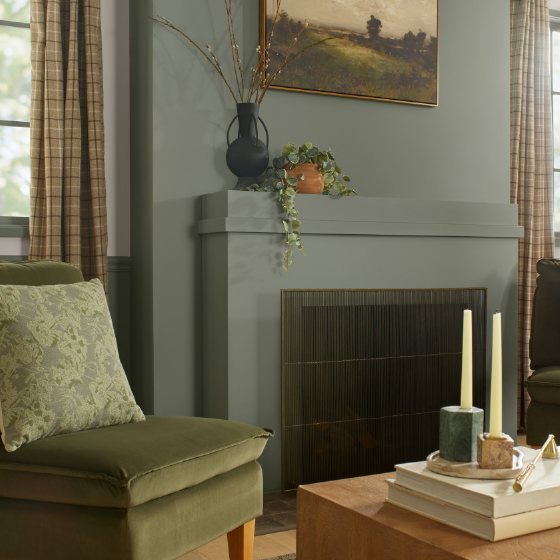
Benjamin Moore chose Silhouette AF-655: a refined charcoal-meets-burnt-umber that feels like shadow, suede and warmth all at once.
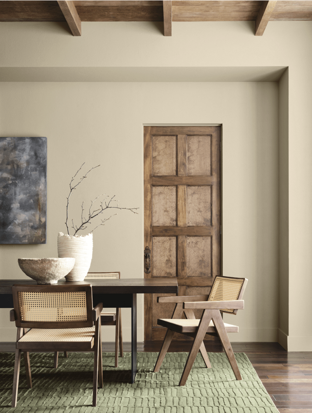
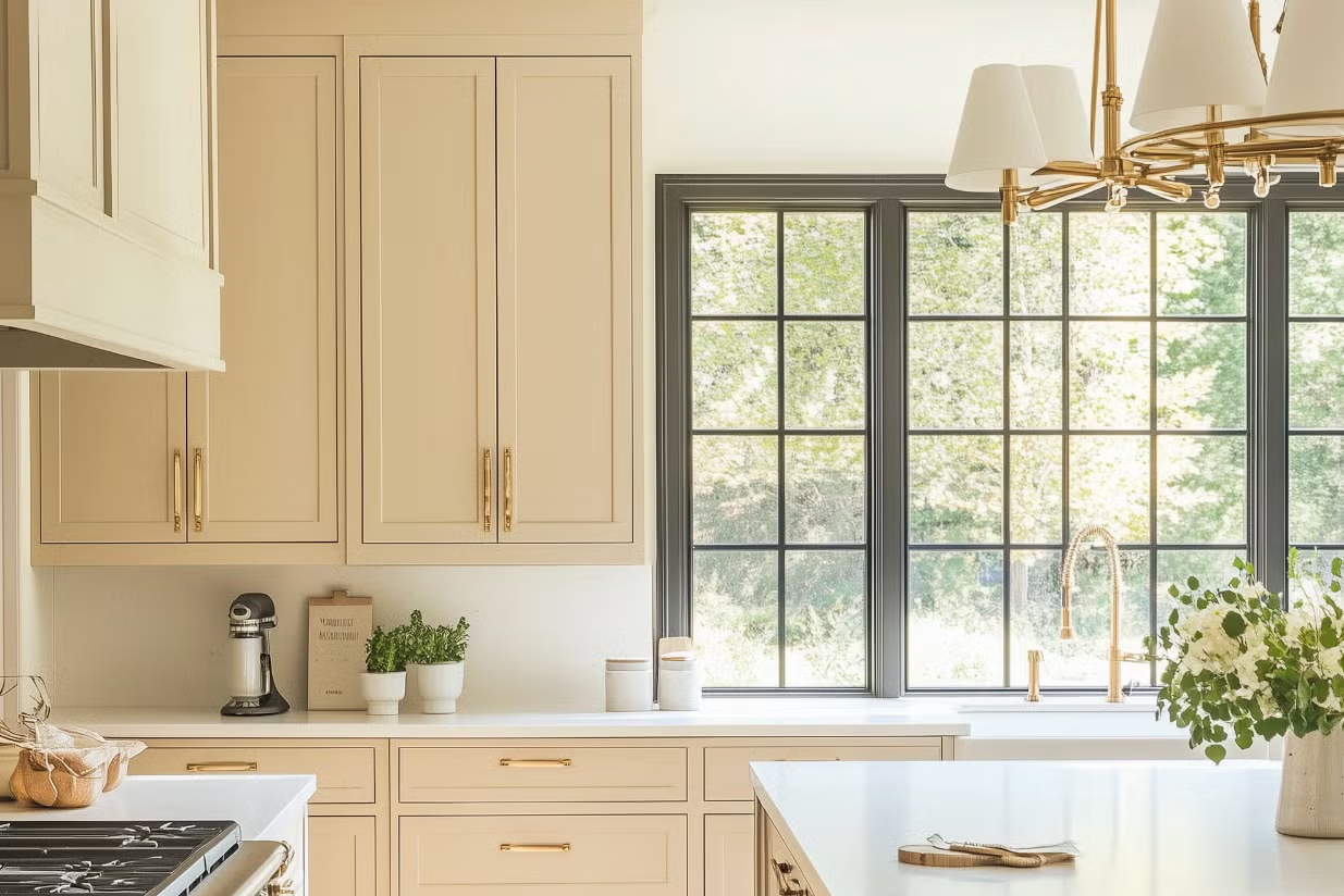
Sherwin-Williams selected Universal Khaki: a soft, natural, earthy neutral that practically exhales.
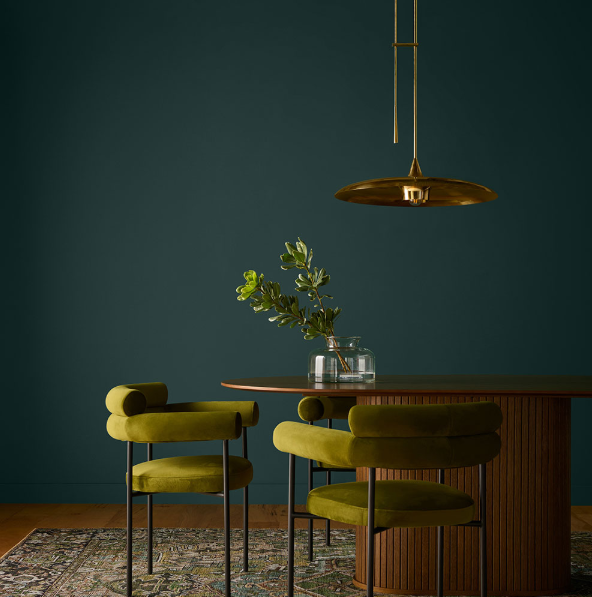
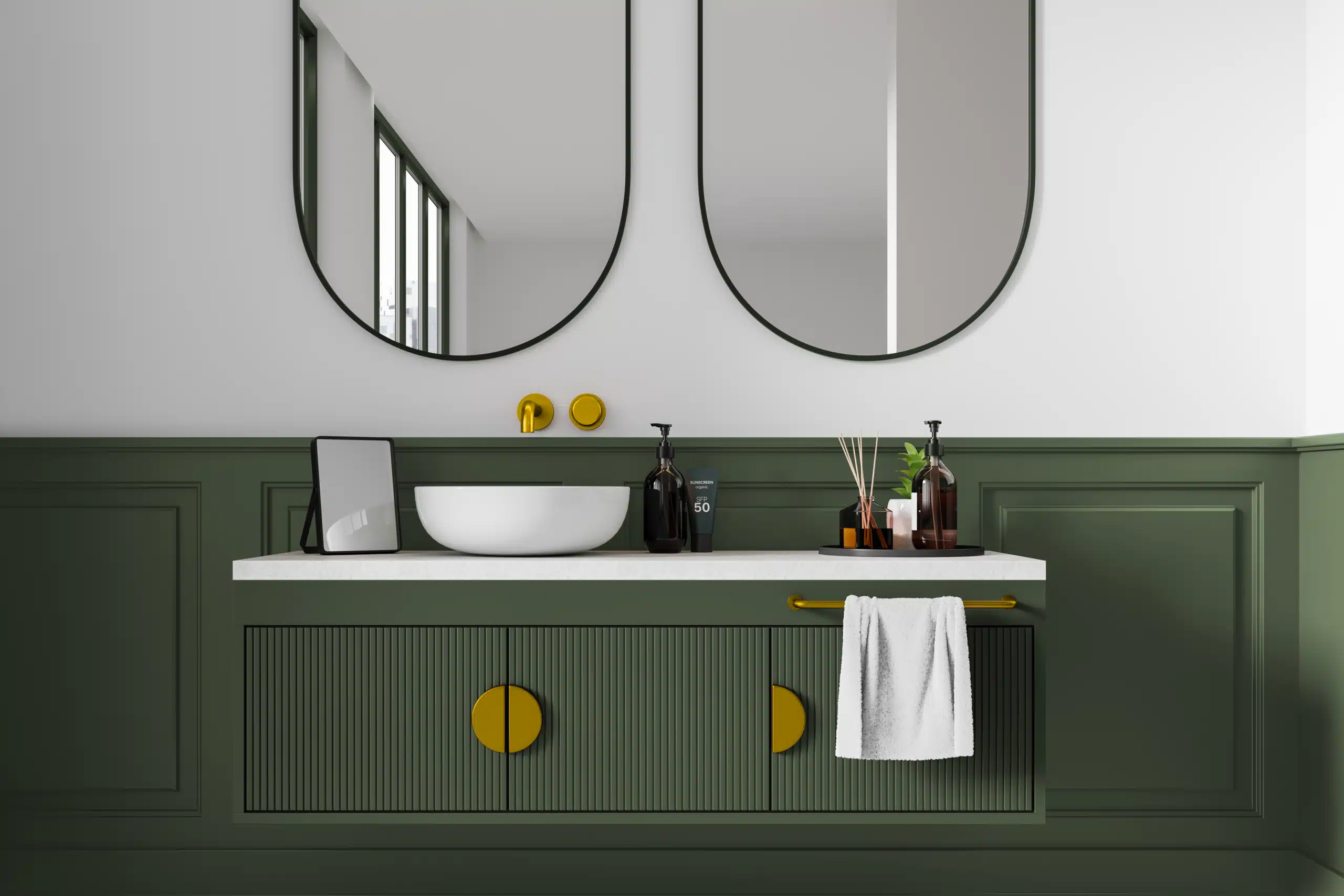
Behr revealed Hidden Gem: a smoky jade green that reads as a new neutral.
Valspar picked Warm Eucalyptus: a muted botanical green with a restorative feel.
C2 Paint introduced Épernay: a luminous, creamy sand tone inspired by Champagne terroir. It’s warm, airy and softly sunlit, striking that rare balance between serene and elevated.
Minwax (because stains matter just as much as paint) highlighted Special Walnut: a timeless, medium-depth brown that feels classic, honest and beautifully grounded.
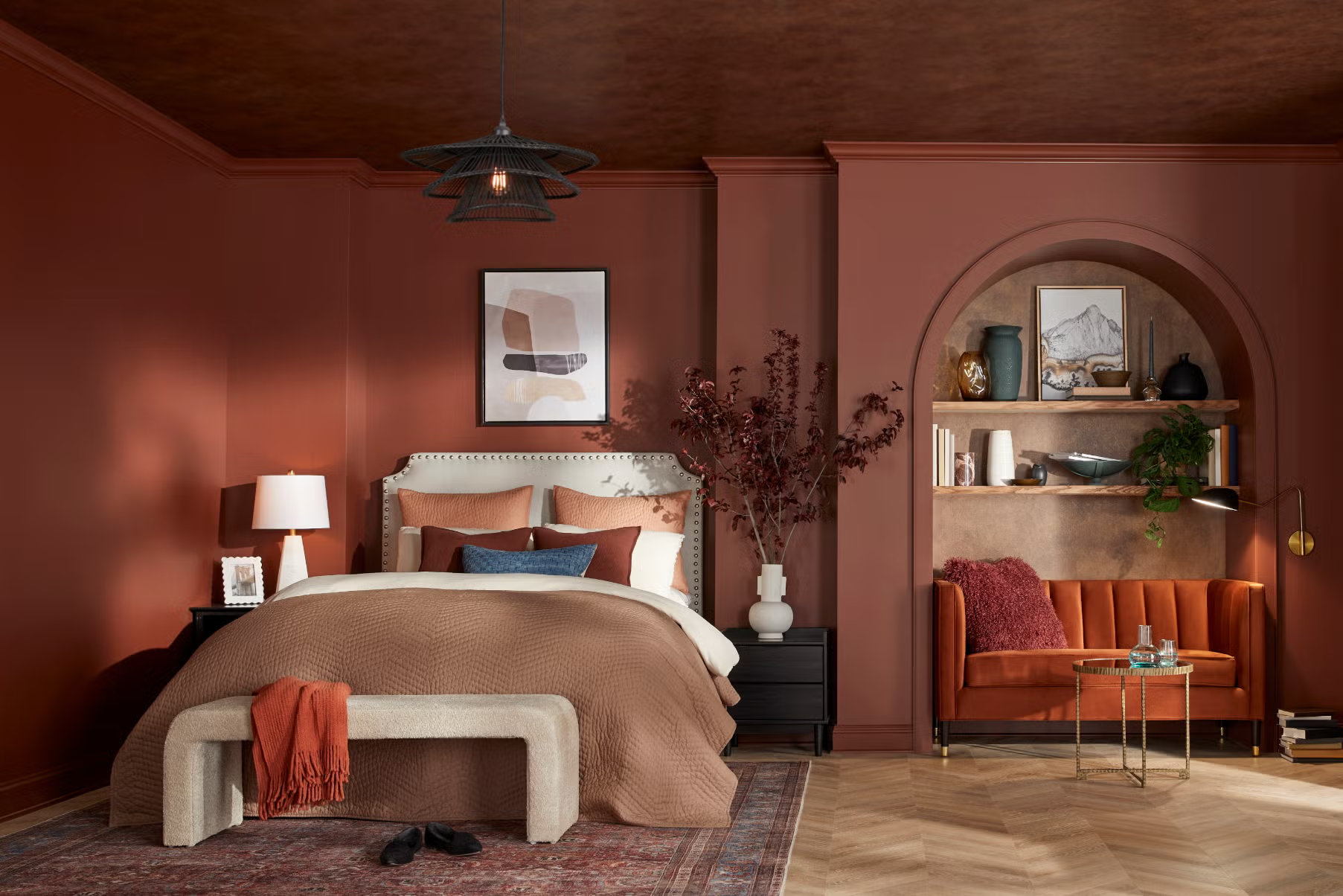
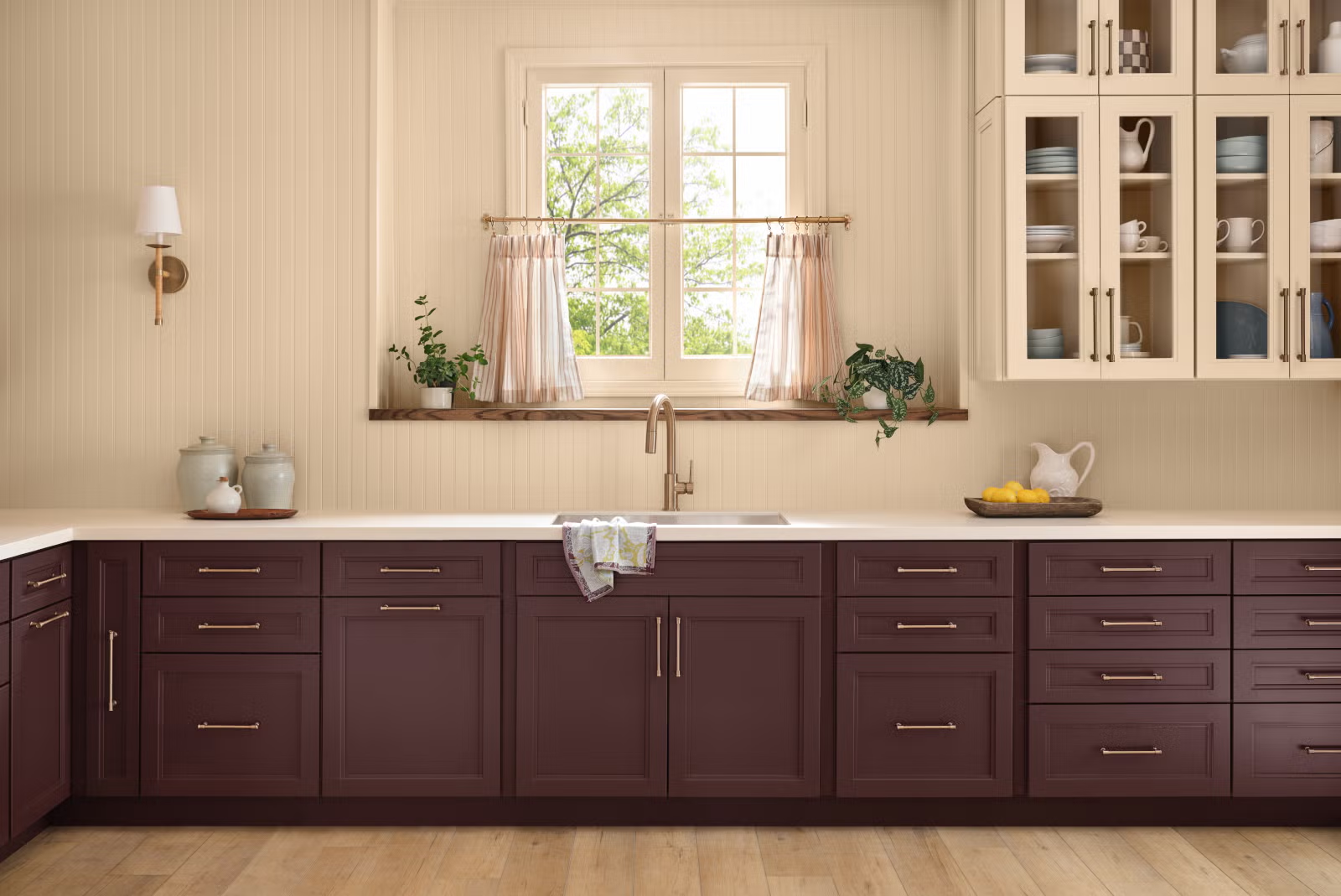
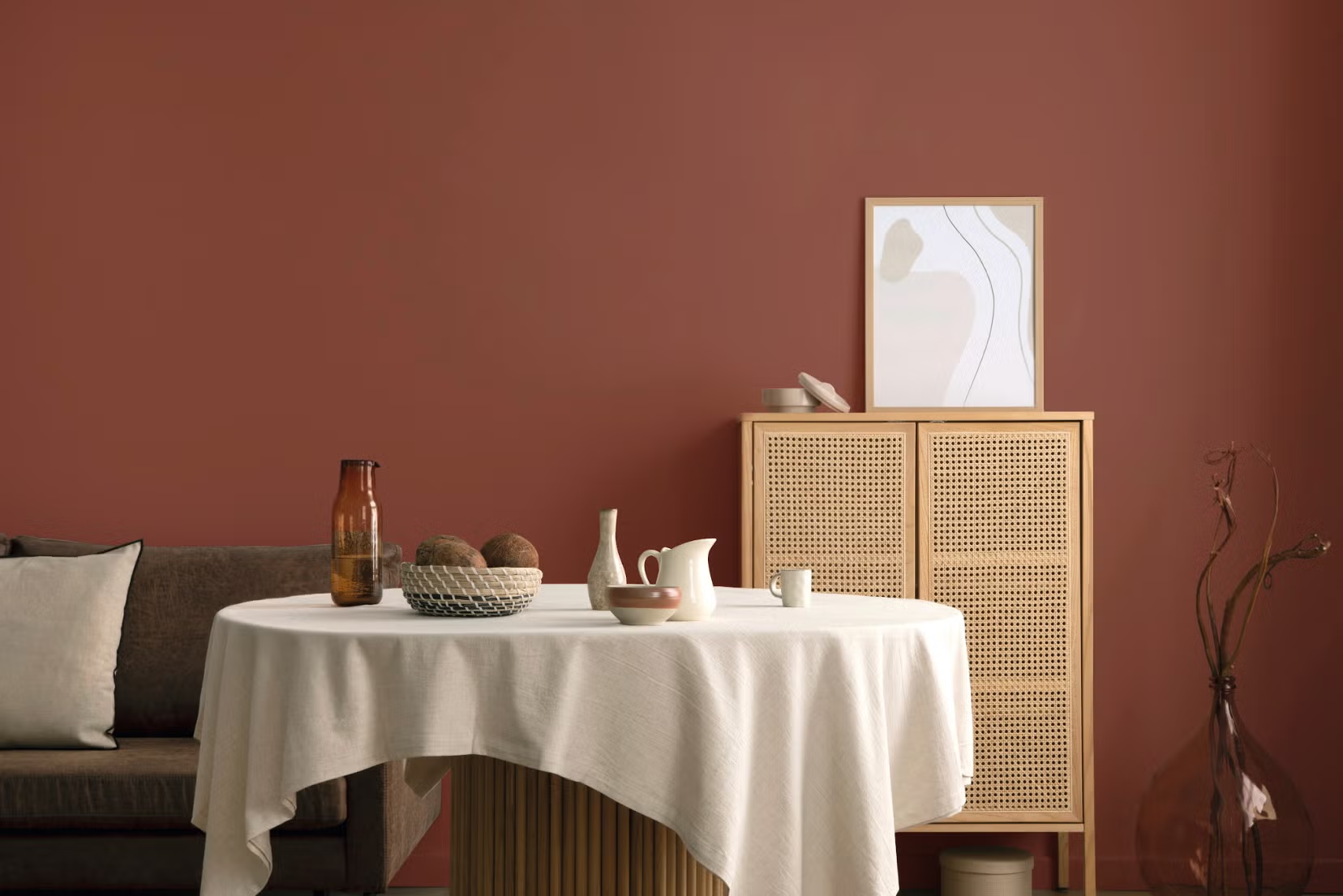
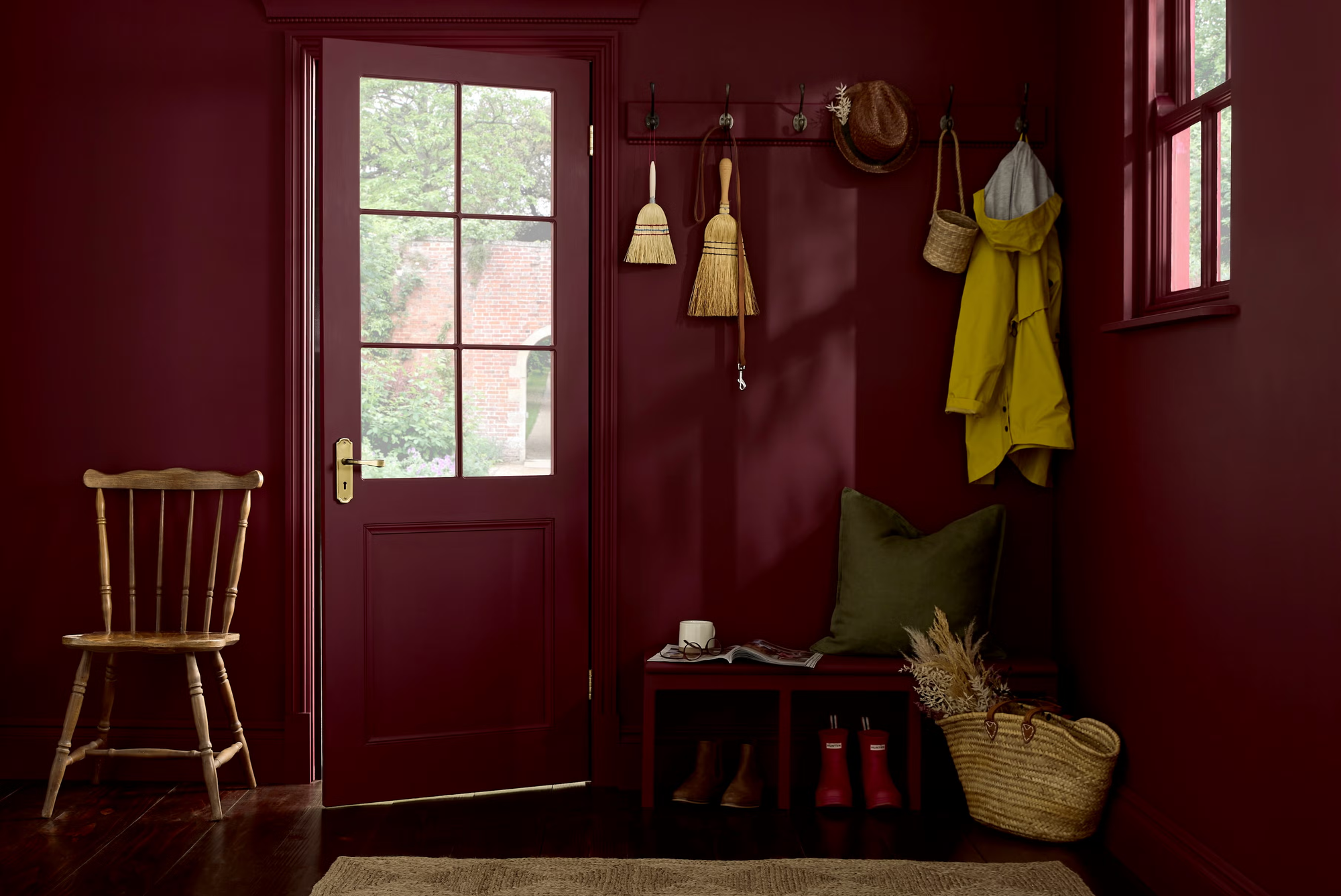
Meanwhile, other brands leaned into plum, mahogany, ochre and hushed jewel tones.
Different hues, yes. But the emotional through-line is unmistakable.
These colors are deeper, moodier and far more grounded than what defined the early 2020s. They feel calm. Mature. Comforting. They feel lived-in rather than performative.
Why now? Because this is exactly where we are as humans.
What These Colors Say About Our Society
We’re exhausted from fast everything.
The last decade has been a whirlwind of micro-trends. Every week brought a new “must-have” color, a new décor aesthetic, a new style to chase. Homes began to feel less like sanctuaries and more like content sets.
2026 breaks that pattern. These colors are slow. They have weight. They aren’t meant to be replaced next season.
They signal a collective craving for longevity, substance and rest.
We’re seeking comfort, safety and emotional grounding.
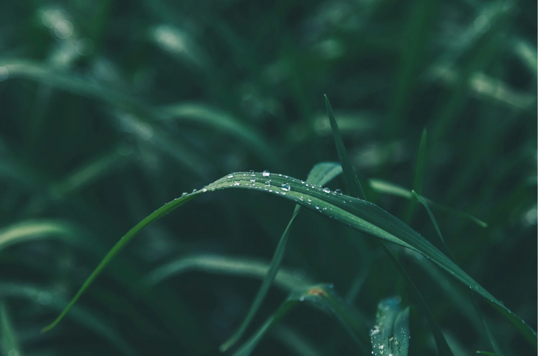
Warm neutrals and botanical greens rise in times of uncertainty. They remind us of nature, earth, stability. They lower the shoulders and soften the breath.
Universal Khaki, Warm Eucalyptus and Hidden Gem aren’t loud. They soothe. They cocoon. They offer reassurance without demanding attention.
They’re the visual equivalent of sitting in a room with soft lamplight, good woodwork and quiet company.
We’re embracing emotional depth, not curated perfection.
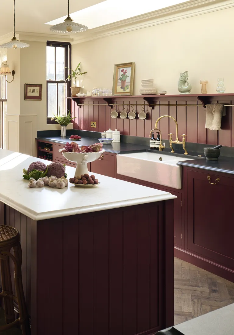
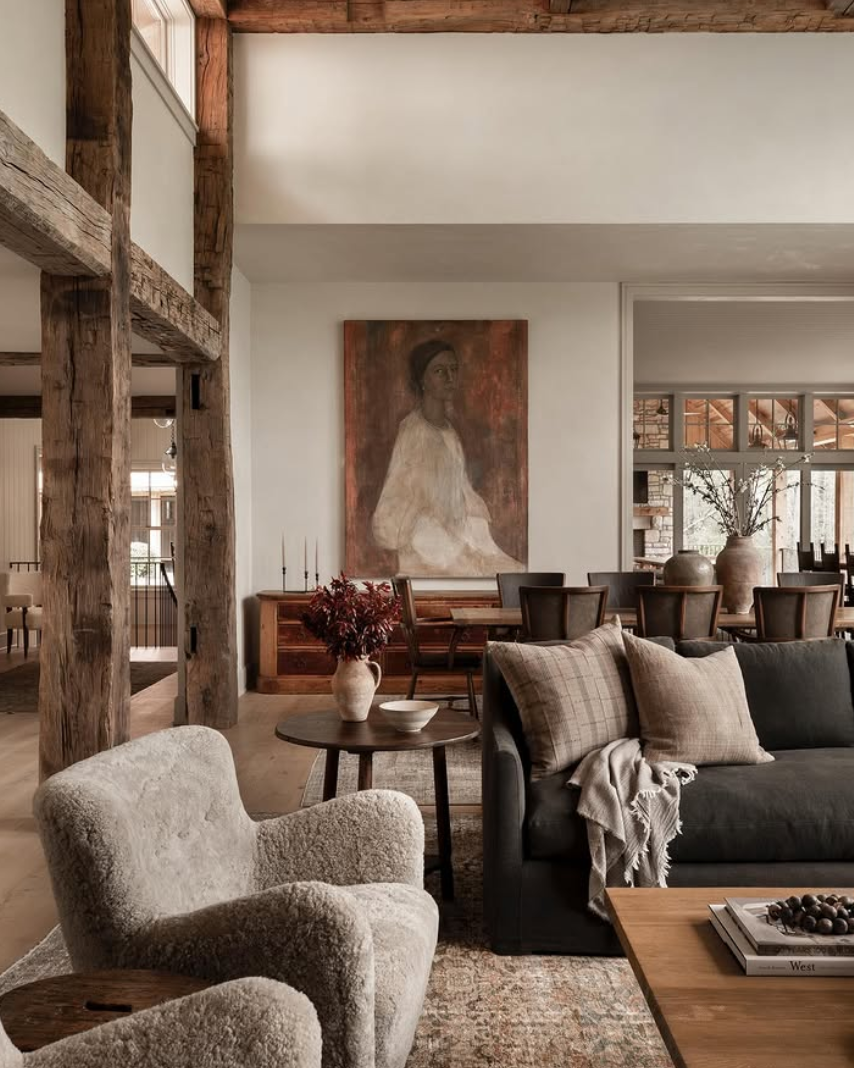
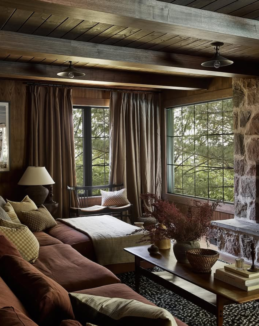
The deeper tones appearing in 2026, plums, charcoals, mahogany browns, reflect a cultural shift toward authenticity and complexity.
The era of the “perfect blank wall” is ending. People want rooms that feel personal, expressive and rich with texture.
Silhouette AF-655 is a perfect example. It’s not breezy or bright. It’s sensual, layered and quietly confident. We’re ready for colors that make us feel something again.
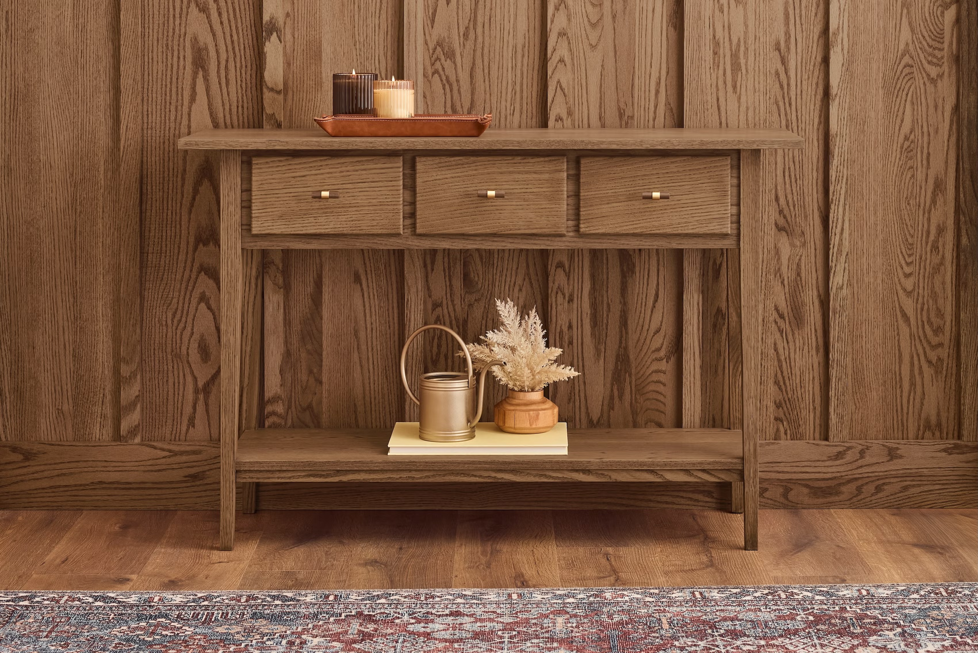
We want materials that feel honest and human.
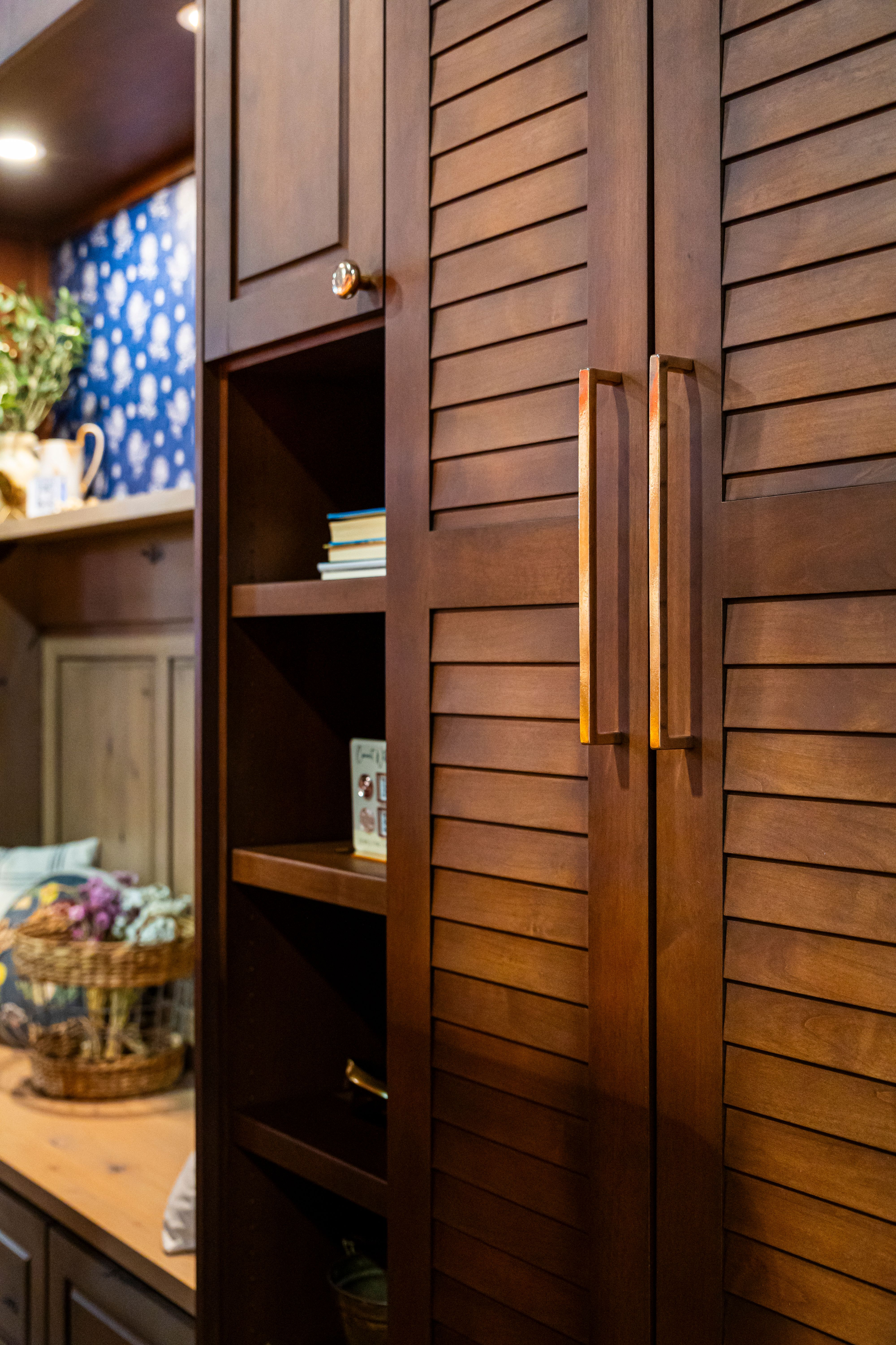
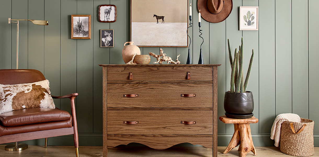
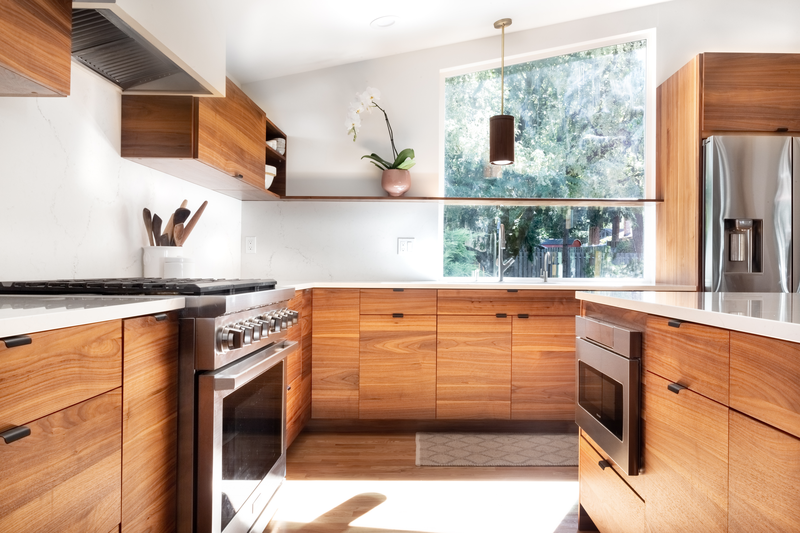
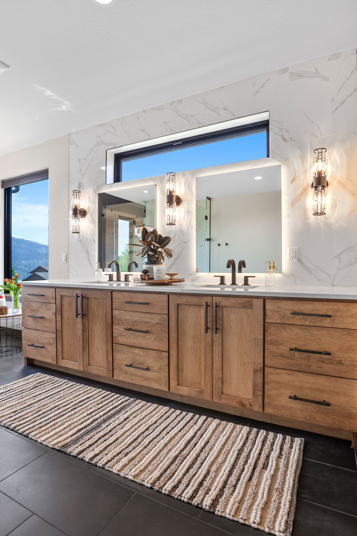
These paint colors pair beautifully with walnut, cherry, alder and oak because they come from the same emotional place.
They’re grounded. Organic. Real.
After years of plasticized, high-gloss, digitally influenced interiors, we’re gravitating toward craftsmanship, texture and the honesty of natural materials.
We want homes that endure.
Every home trend cycles. But the steadiness of the 2026 palette suggests something deeper.
People want to invest in spaces that will age well. Rooms that can evolve with them. Colors that don’t expire.
There’s a subtle rejection of disposability happening here, and it shows.
What This Means for Design in 2026
This shift toward depth and groundedness is a gift for both designers and homeowners.
Because these colors invite quiet layers rather than loud statements, they create the perfect backdrop for:
• warm wood cabinetry
• soft, textural upholstery
• unlacquered metals
• handmade ceramics
• natural stone with movement
• lived-in luxury
A room painted in Hidden Gem or Warm Eucalyptus lets walnut grain glow. A kitchen done in Universal Khaki feels instantly more architectural. A moody powder room in Silhouette becomes intimate, elegant and timeless.
These tones don’t compete with materials, they collaborate with them.
This is the year of “let the grain shine.”
How to Use These Colors Right Now
If you’re designing a space in 2026, here’s how to make this palette sing:
1. Choose one grounding neutral.
Universal Khaki, Warm Eucalyptus, or any soft earth-tone creates a stable base that feels serene rather than sterile.
2. Add one deeper, emotional tone.
Hidden Gem, Silhouette, eggplant, mahogany, smoky teal. Let it appear in cabinets, built-ins, a feature wall or trim. DeWils has just the paint colors for that too!
3. Pair everything with warm wood.
Walnut, cherry, alder, quartersawn white oak; these species amplify the warmth and richness of the palette.
4. Keep finishes soft.
Matte and satin sheens help these colors maintain their grounded feel.
5. Layer texture like it’s oxygen.
Woven rugs, boucle, plaster, linen, and cerused wood. These colors love tactile company.
The Heart of It All
The 2026 Colors of the Year aren’t random selections. They’re emotional barometers.
They tell us that we’re ready for homes that feel meaningful rather than manicured. Homes that comfort, not impress. Homes that reflect who we are, not what is trending.
These colors whisper instead of shout. They steady instead of stimulate. They bring us back to ourselves.
And maybe that’s what we need more than anything right now.