The Art of Whimsy: Color, Play, and Personality at Market

For the past several seasons, interiors have leaned toward calm and control: clean lines, quiet palettes, and the safety of “timeless.” But this Market told a different story. Designers are loosening their grip on perfection and reaching for something far more interesting: whimsy.
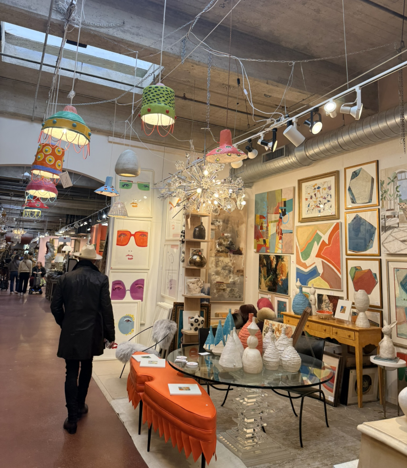
Across showrooms, there was an undeniable sense of play. Curves, color, and character took center stage, proof that joy, not just restraint, deserves a seat at the design table.
Curves with Confidence
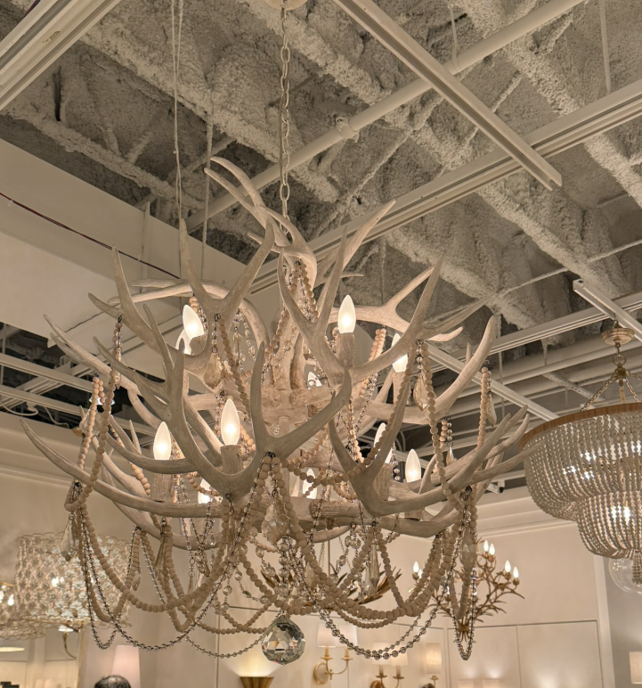
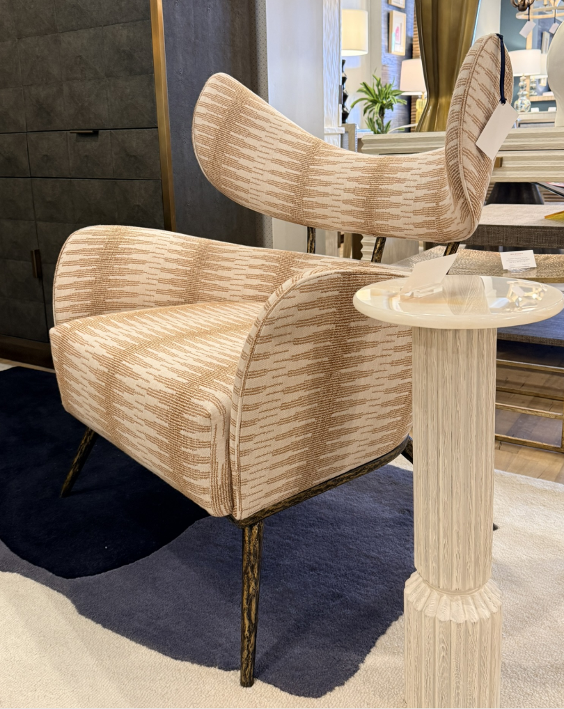
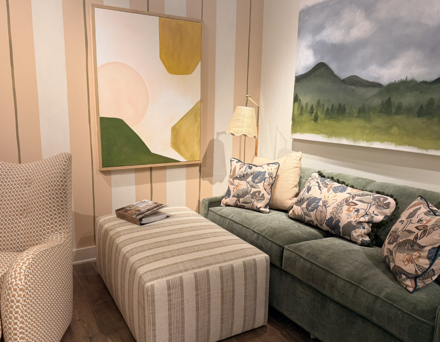
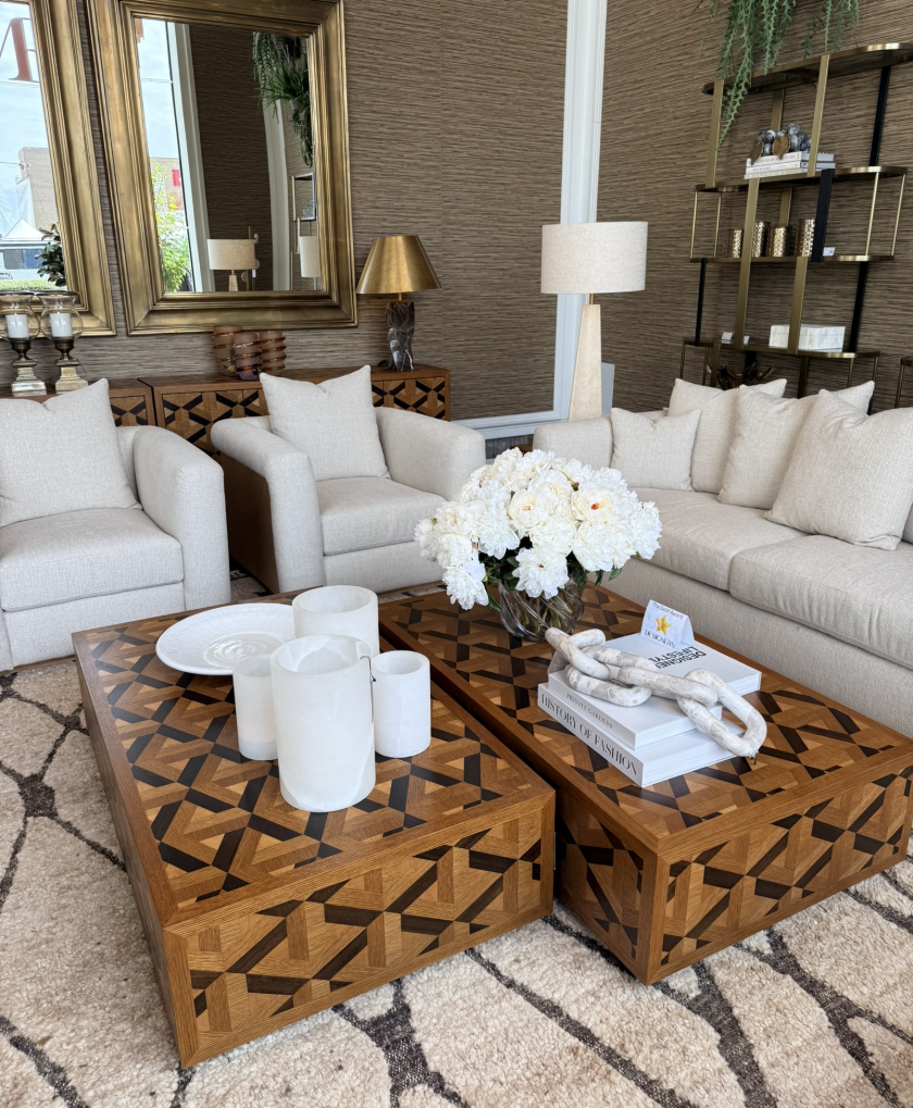
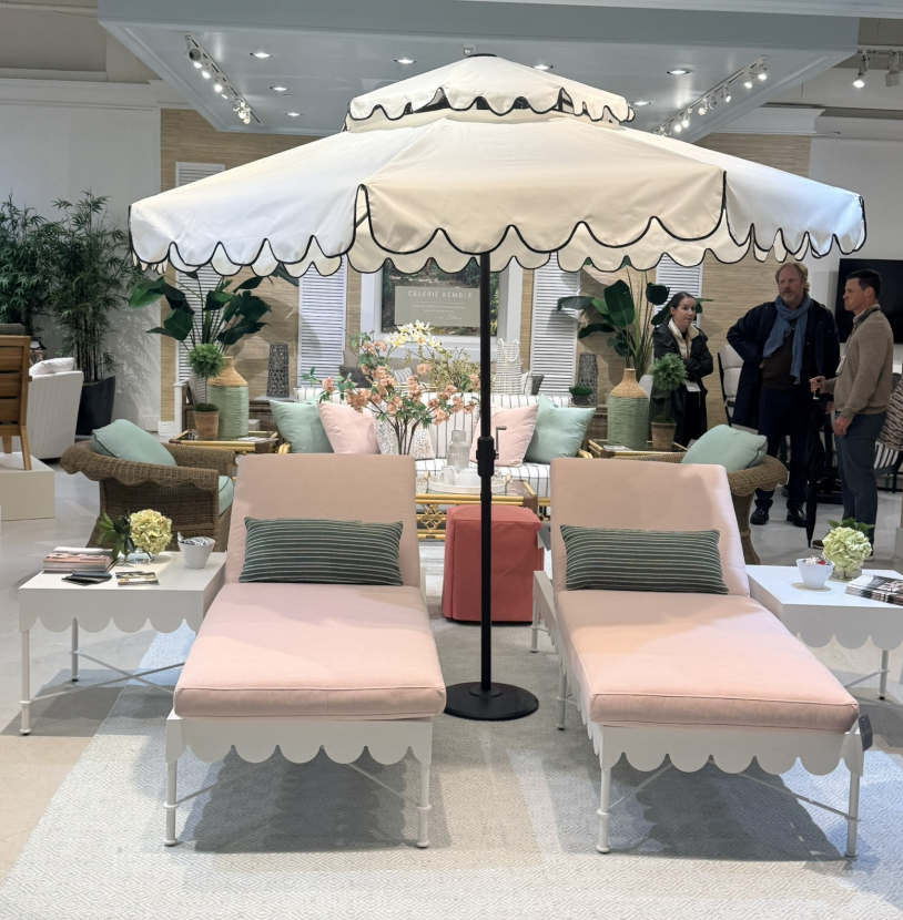
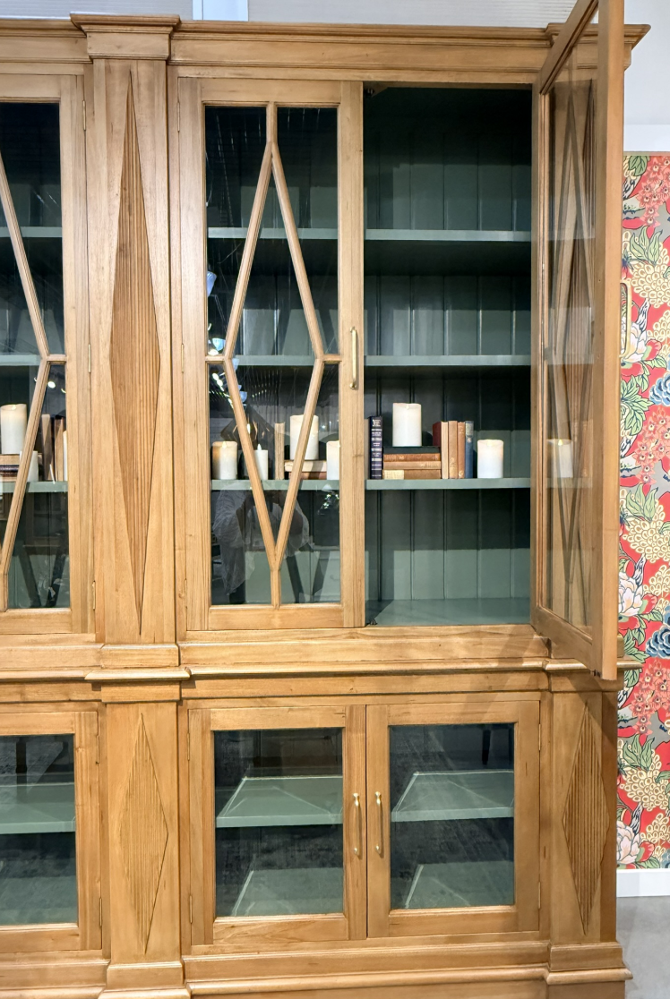
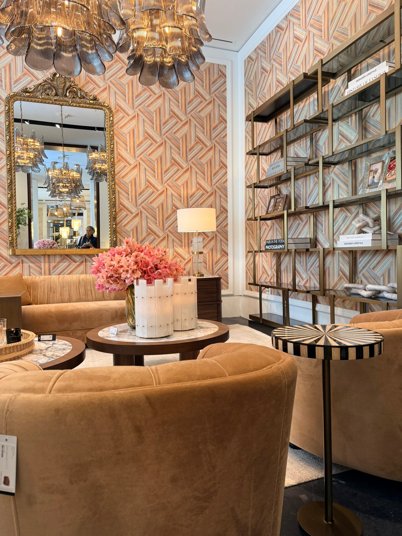
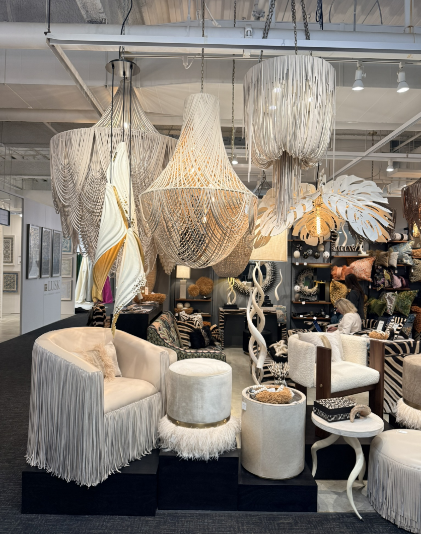
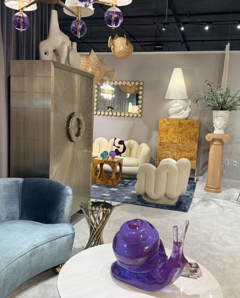
Gone are the rigid silhouettes and sharp-edged minimalism of the last decade. In their place: softer, more generous forms that invite curiosity and conversation. Sofas looked like waves; tables felt sculpted, not manufactured. Even cabinetry and casegoods embraced rounded corners and organic profiles.
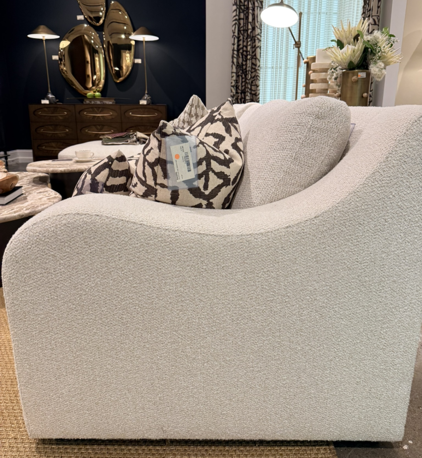
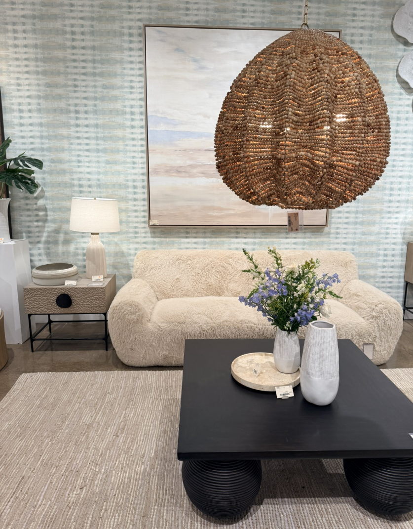
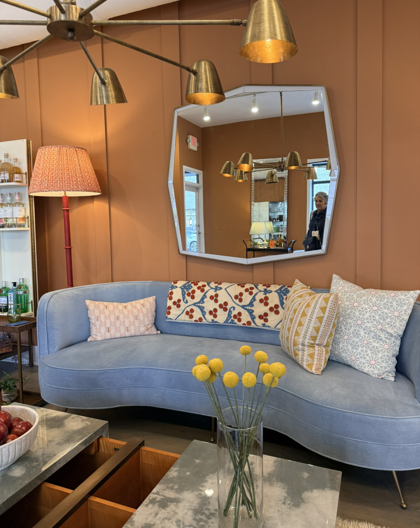
This shift toward curvature isn’t just aesthetic, it’s emotional. Curves make spaces feel human. They soften our environments, suggesting movement, warmth, and comfort. The result? Rooms that feel welcoming, not sterile; elevated, but never intimidating.
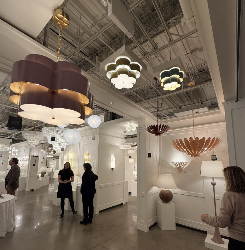
Color with Personality
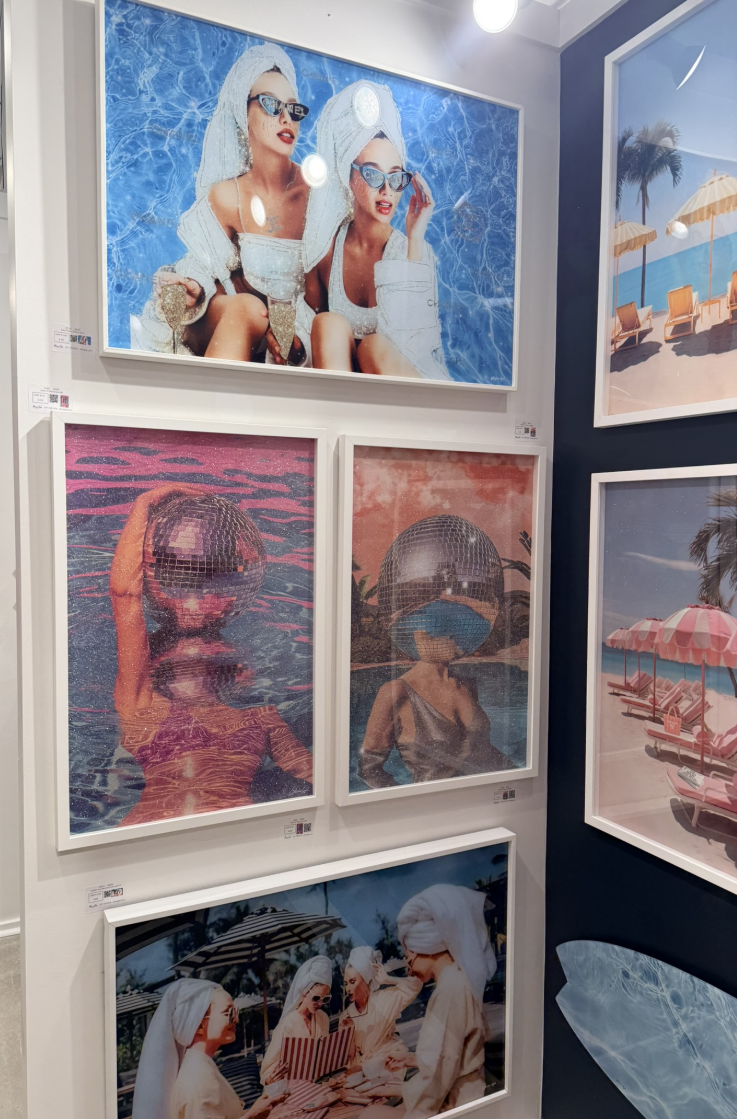
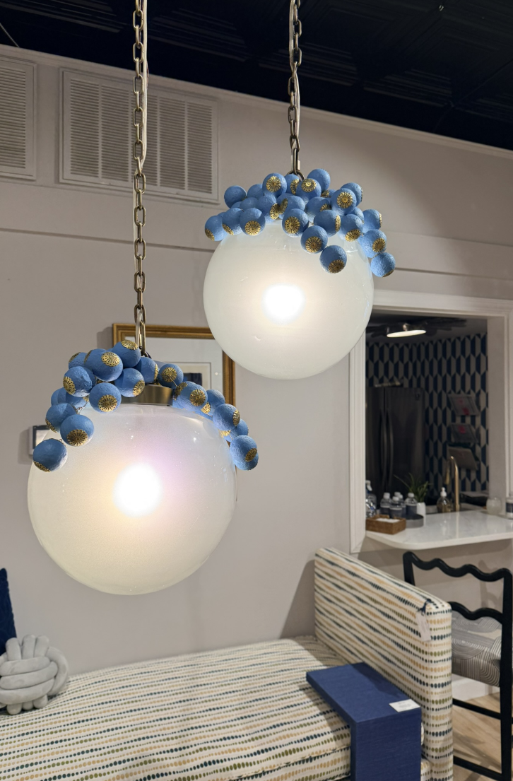
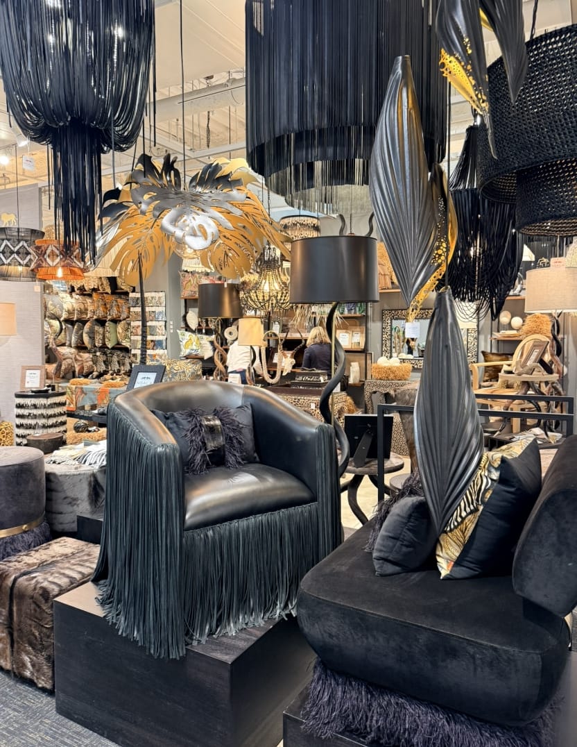
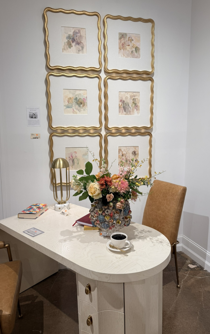
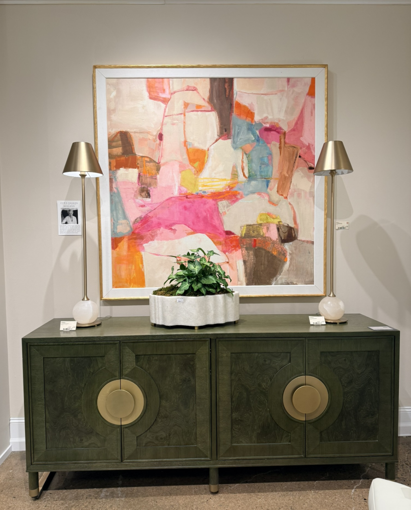
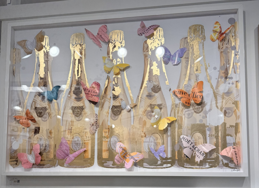
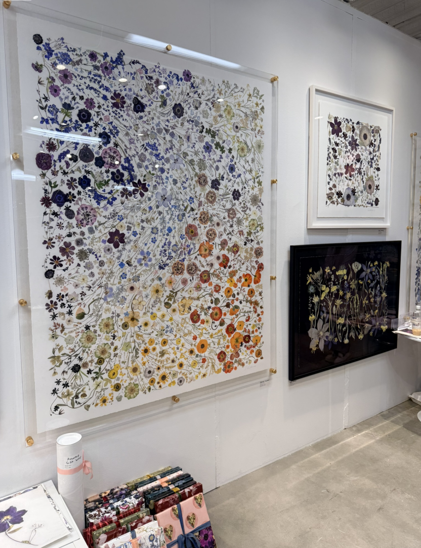
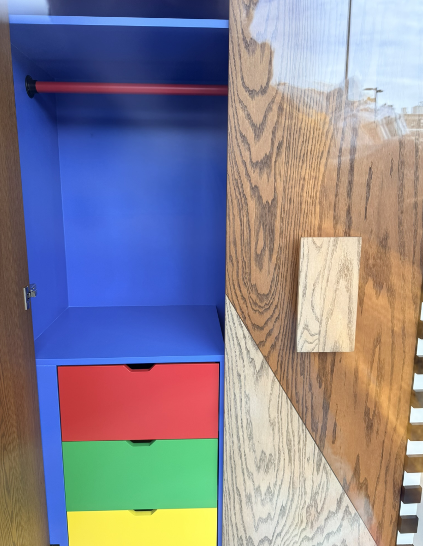
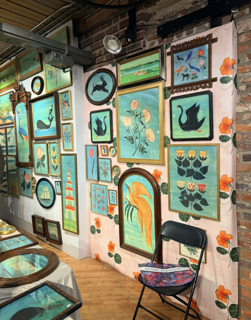
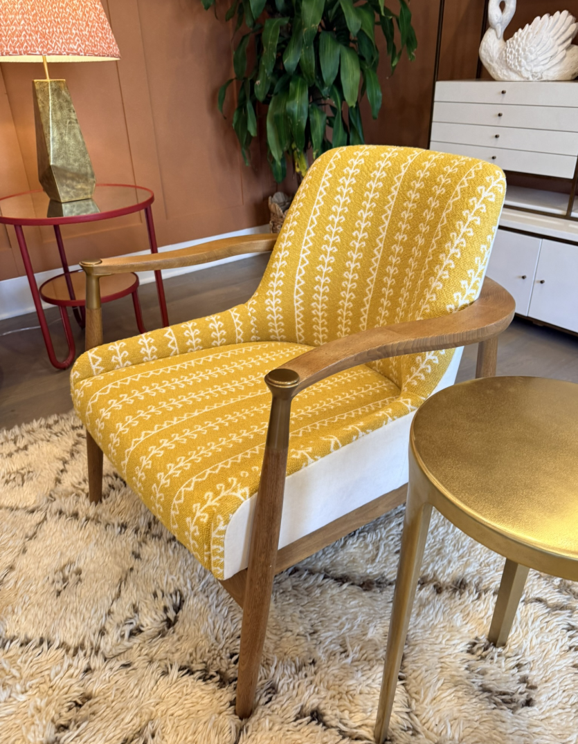
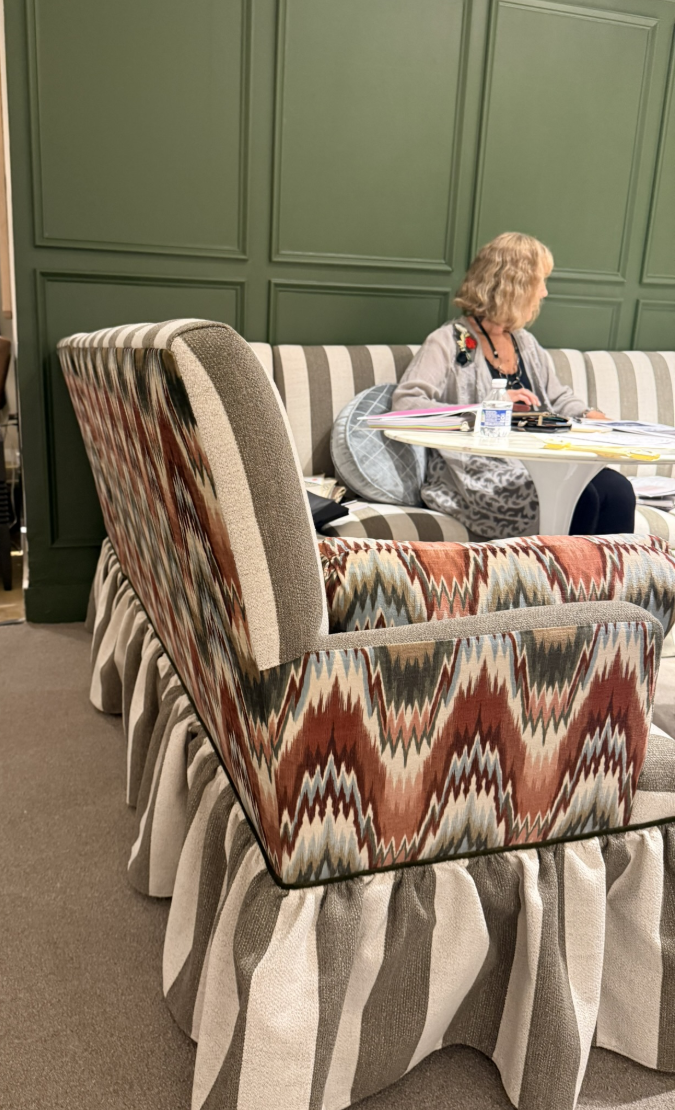
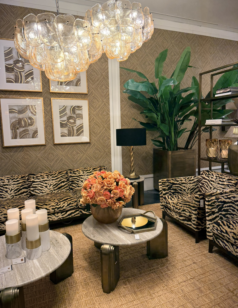
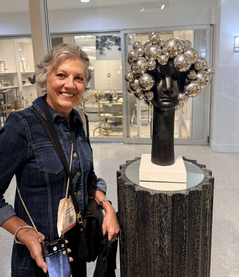
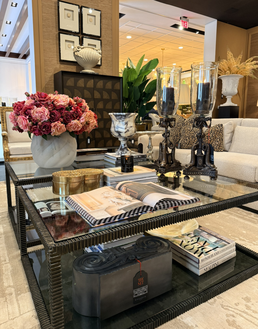
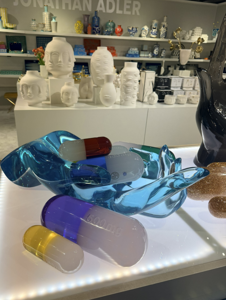
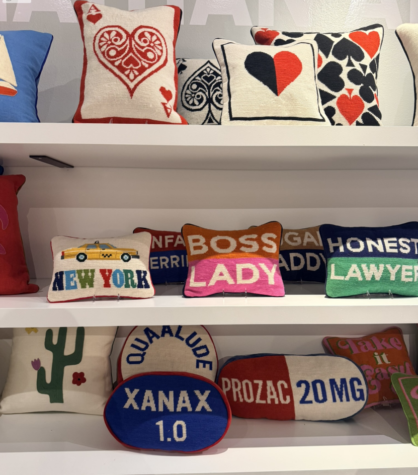
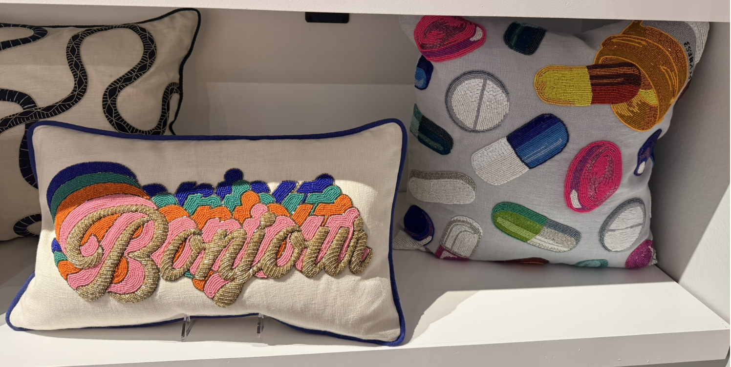
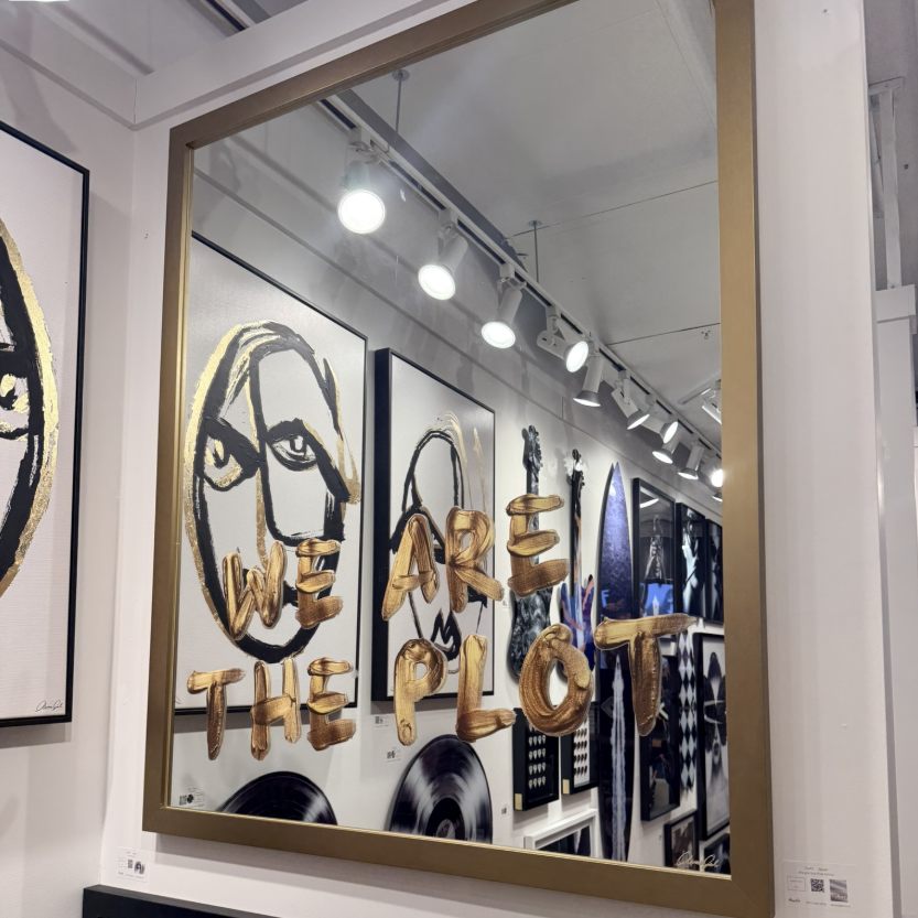
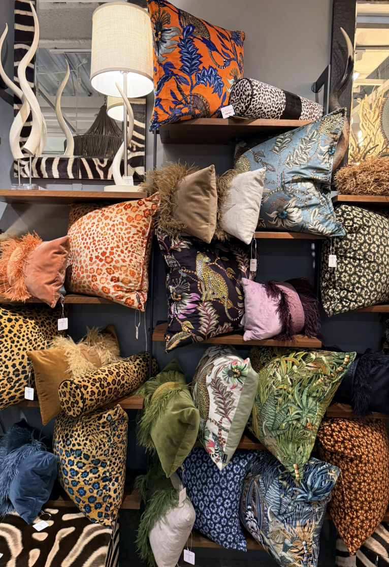
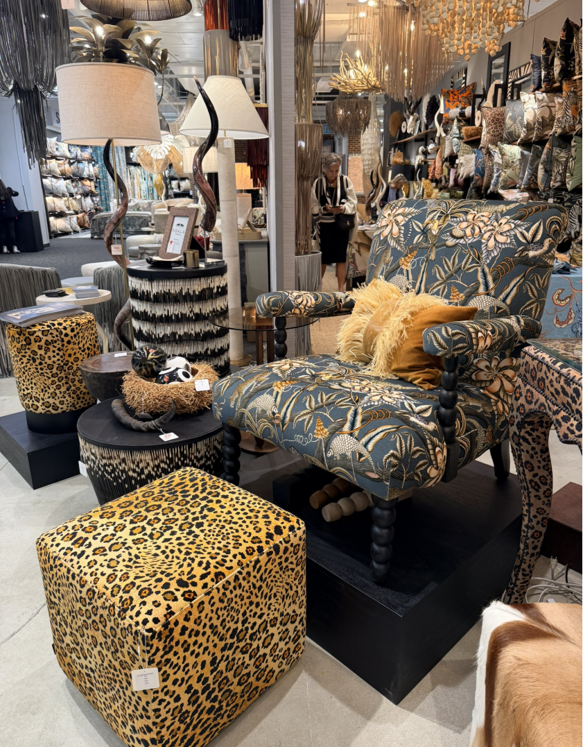
Whimsy found its strongest expression through color. Candy tones, painterly fabrics, and saturated accessories brought a sense of vitality back to interiors. I saw coral vases, lavender upholstery, butter-yellow lamps, and deep green art panels all coexisting beautifully.
Rather than chasing a single “it” color, designers seemed to be asking a more personal question: What color makes this space smile?
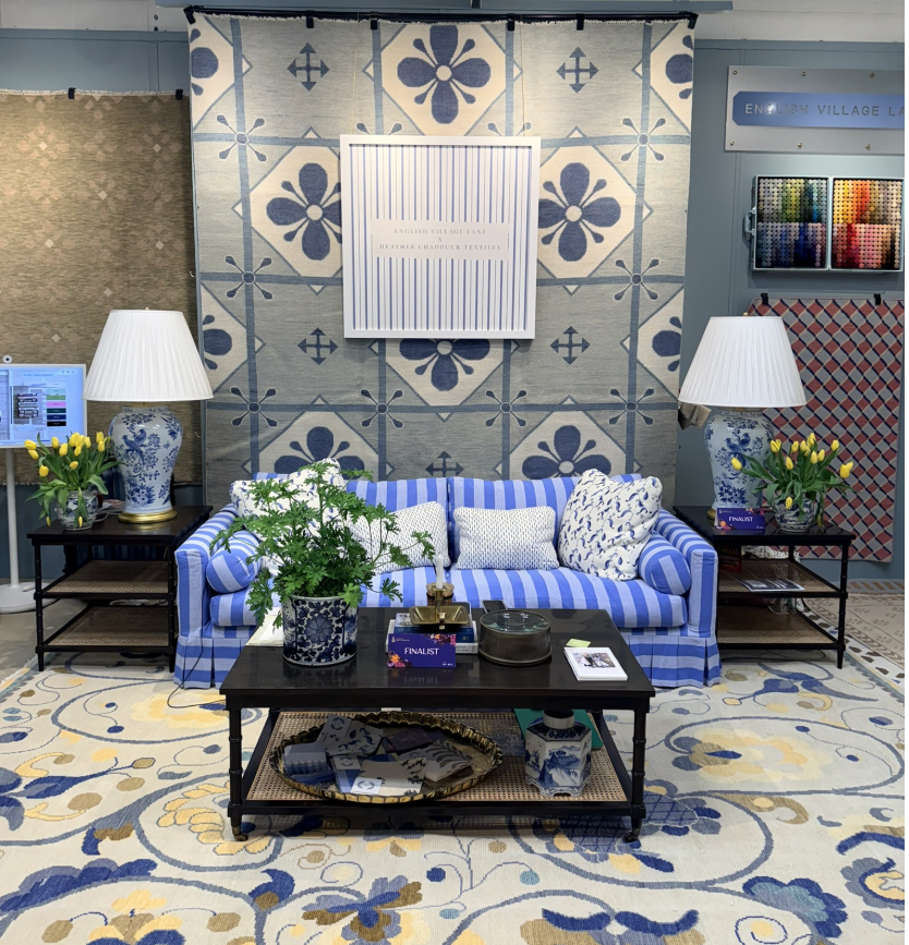
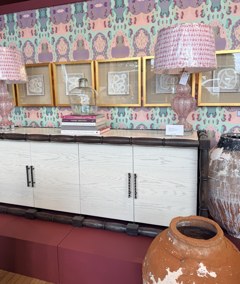
That mindset led to unexpected pairings: terra cotta with blush, moss with plum, sky blue with ochre. These combinations felt fresh and instinctive, less about theory and more about emotion. It was a celebration of intuition, proof that design doesn’t have to match perfectly to feel perfectly right.
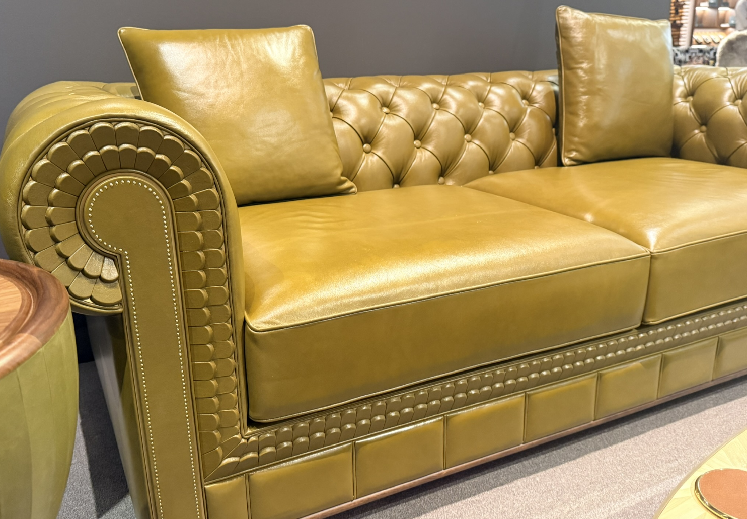
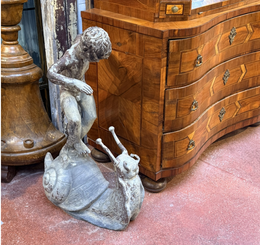
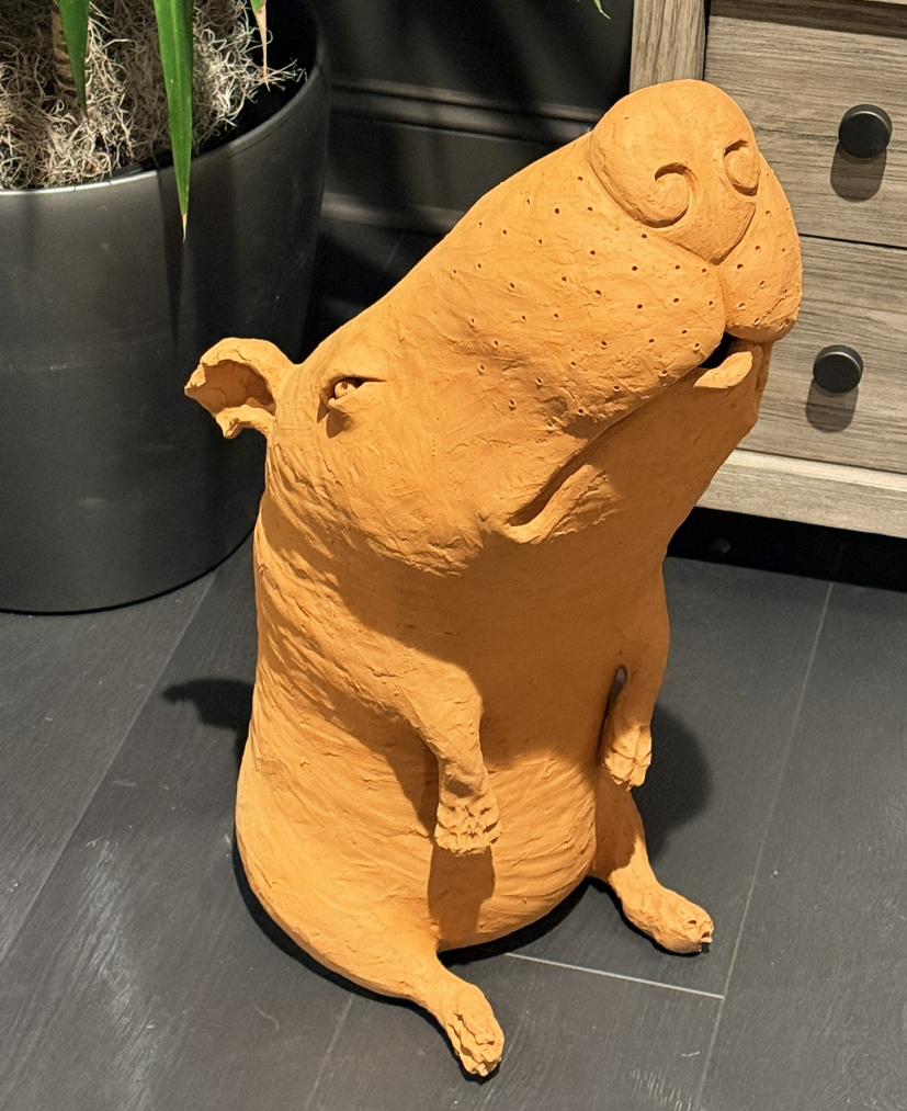
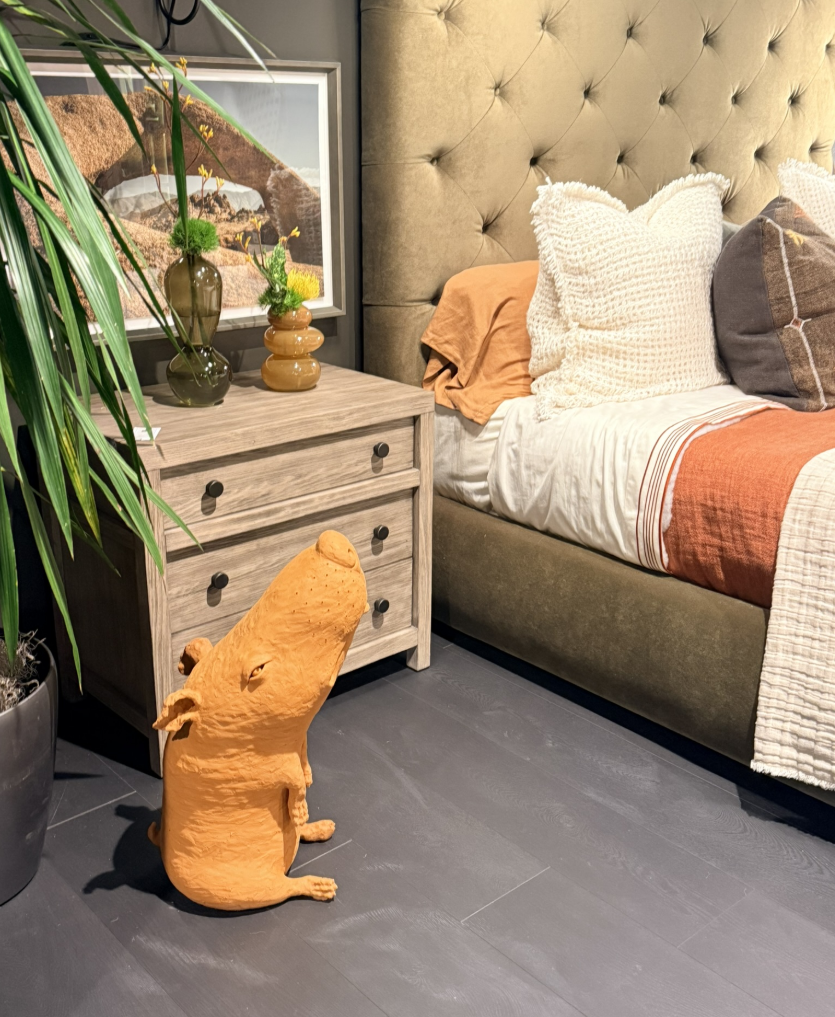
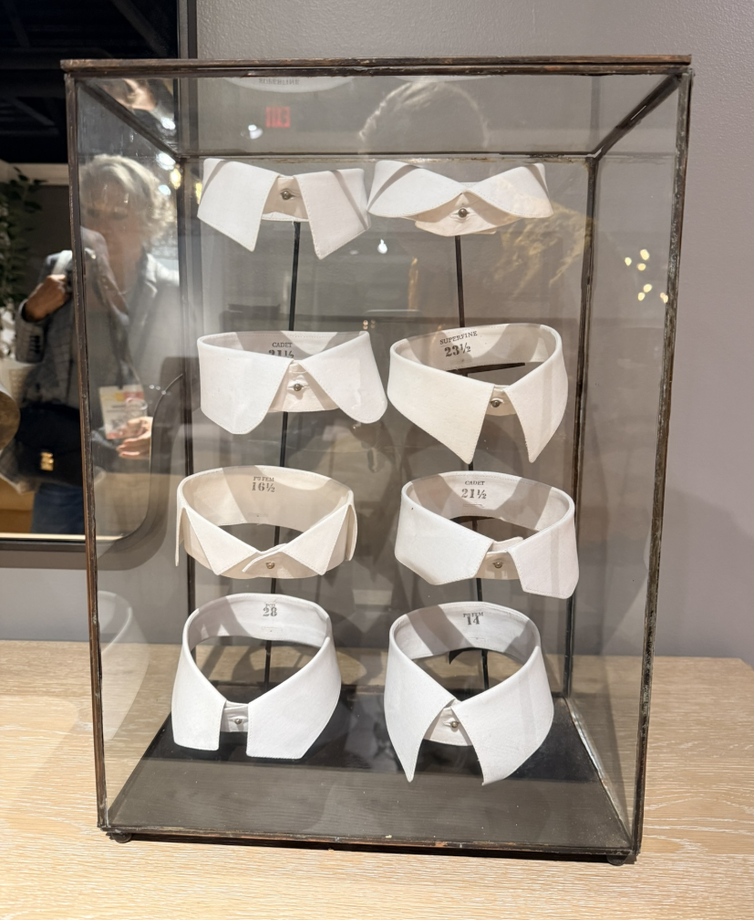
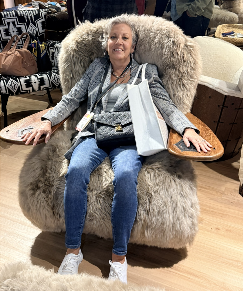
Furniture with Character
Another standout moment at Market was the rise of furniture with personality.
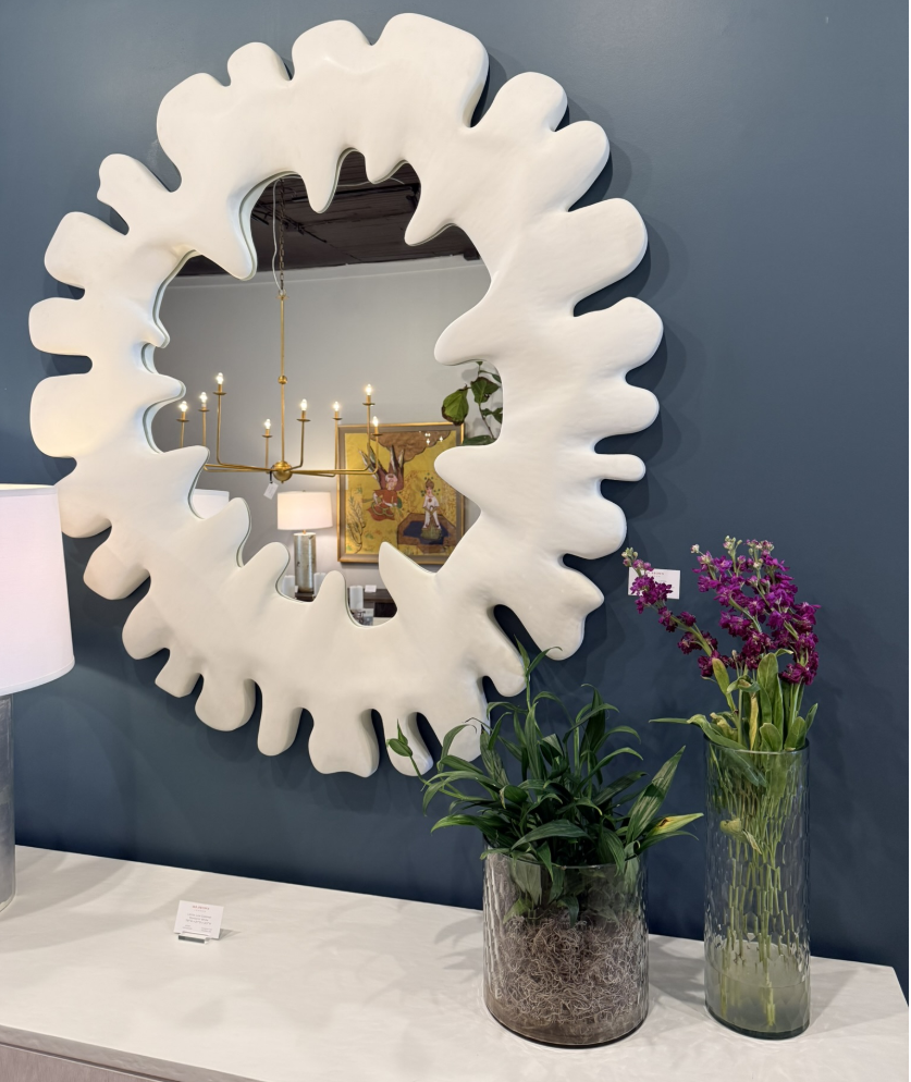
Legs were sculpted, bases were playful, and details felt delightfully unnecessary in the best possible way: scallops, ruffles, fluting, and carved flourishes that added charm and movement.
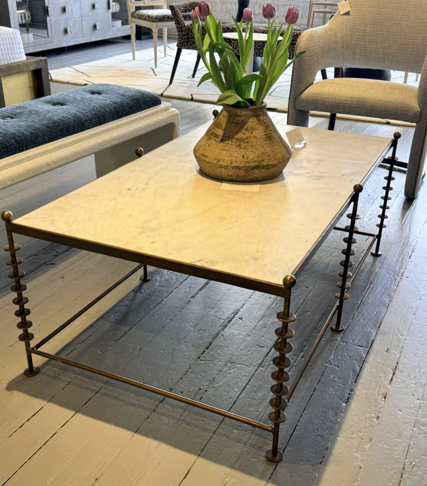
This new wave of design isn’t trying to impress with perfection. It’s winking at you. It’s having fun again.
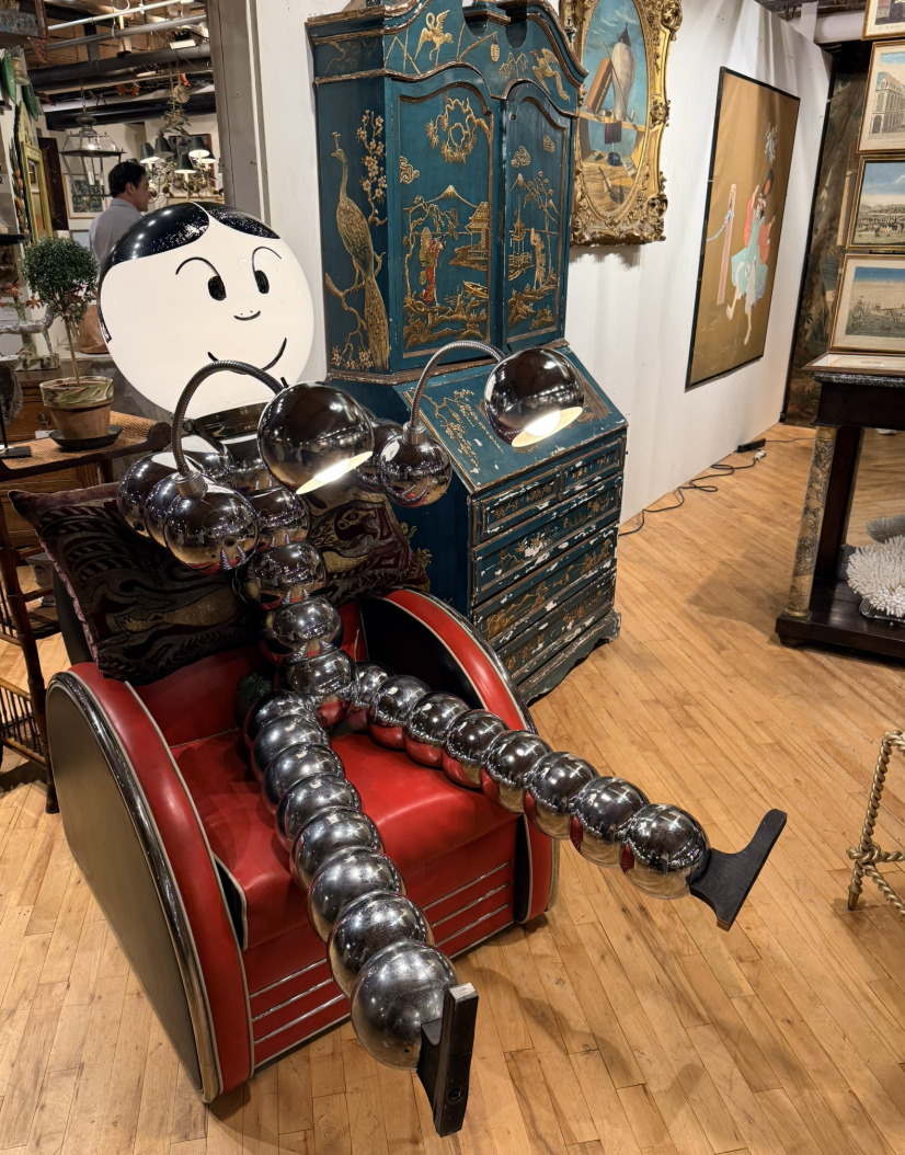
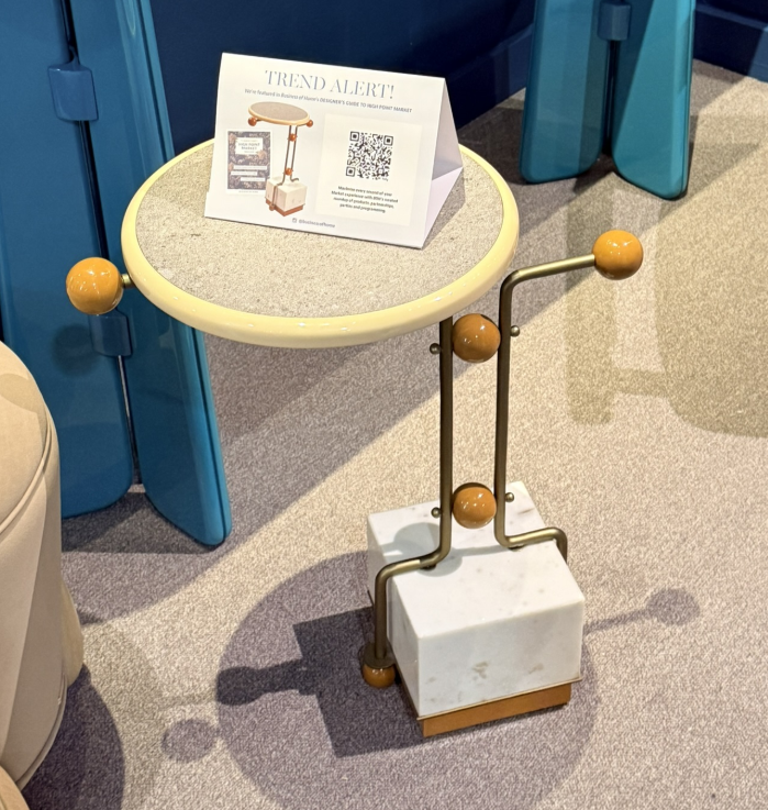
The effect is deeply human, reminding us that joy, humor, and quirk have a place in sophisticated spaces. A well-placed scallop or playful silhouette can say as much about a designer’s confidence as any neutral palette ever could.
The Joy of Imperfection
For years, minimalism told us that good design was about editing; about taking things away until only the essentials remained. But the pendulum is swinging back. The most memorable spaces now feel lived-in, layered, and emotionally rich.
Whimsy invites us to bring back story. To embrace asymmetry, spontaneity, and the pieces that make us smile for no practical reason at all. Because maybe the best kind of balance isn’t perfect, it’s personal.
Trusting Your Gut
The strongest thread running through all this playfulness is intuition. Designers are trusting their instincts more than algorithms, choosing what feels right instead of what trends predict.
When you lean into your own joy, a color that makes you grin, a form that feels playful, a texture that surprises, your work becomes unmistakably yours.
Final Thoughts
Whimsy isn’t about chaos or clutter. It’s about courage; the courage to bring a bit of delight into serious design.
This Market made one thing clear: fun is back. Not frivolous fun, but soulful, expressive, deeply human joy. The kind that reminds us why we fell in love with design in the first place.
So go ahead. Add the scallop. Paint it lilac. Choose the table with the funky legs. Because sometimes, the most professional thing a designer can do is play.